Previously in levels 4 and 5 the Context of Practice module has been the most challenging and definitely interested me the least out of the other modules. I have never found that essay writing is one of my strengths, however through the skills picked up throughout the past two years, alongside learning from mistakes, has made me more determined to work hard on Cop 3. Since this was a 6-9,000 word essay in comparison to the standard 3,000 in levels 4 and 5, this was daunting at first and extremely challenging, requiring a higher level of critical comprehension and research than previously undertaken. Choosing a subject that interests me has benefited the project massively, proving to be far more engaging than research questions in the past. It was highly challenging but allowed me to explore a subject I am interested in, religion, combined with graphic design. I was able to incorporate fundamental knowledge I already had on the sociological aspect of religious theory, and build on it to form a wider understanding of brand theory, as a whole and in relation to religion. Formulating a time plan helped keep me on track but due to circumstances and changing of ideas, it was not always easy to stick to it. However, keeping a record of what I needed to do helped to motivate and push me.
The practical side of the module has been my most enjoyable if not frustrating on the course to date. Choosing to produce an actual product with a substantial amount of deliverables proved to challenge my capabilities digitally and physically. I had not yet chose a packaging brief which I produced the physical packaging for rather than relying on a mock up. I learned that manual folding/constructing is still not my forte however I learned skills for embossing and creating nets.
Being introduced to ceramics was extremely interesting and rewarding to the overall process, as I had to think constructively in terms of creating a fully functional bottle inside a jesmonite cast. There was many errors but through support and learning I finally achieved what I wanted to. Overall, learning more about ceramics has introduced a newfound passion which will be carried out towards extended practice.
The most beneficial area to this module is the skills I have picked up when producing practical work. Last year I had only touched on After Effects and knew very little. Learning this by trial and error was the method I chose, as what I wanted to produce was something quite simplistic. I was proud of the videos I produced and of the skills I can now take further.
As for the practical work overall, it is rewarding to see that you are producing work that not only interests you, but coincides with the written element and research. It is evident in comparison with level 5 Context of Practice that I enjoyed this module a lot more, and really immersed myself in it. Through it, I have gained a portfolio piece that I am ultimately proud of and that is extremely important to my practice.

Thursday, 12 January 2017
Wednesday, 11 January 2017


COP 03 / Practical / The Stone

The final stone
After many hard working hours in the ceramics room, finally a working bottle rock was born. The form of this bottle was a little different at the top, because of the problems with the bottle being sealed in however in retrospect, this shape looks as though the bottle is emerging (like Jesus did), and looks quite dynamic.
The rock was made out of Jesmonite and white pigment to connote purity, whilst the shape aimed to look as natural as possible whilst being created from a clay mould by hand. The icon is on the front as I felt if the name of the brand is on the packaging and other deliverables, this left a bit more ambiguity and mystery, looking like a rock that someone has etched onto without any explanation.
Evaluation:
Although I am very pleased with how this turned out considering I had never used any of the materials before, if I was to improve this it would be by using a better quality nozzle. Because of the stress of trying to craft a working bottle within a jesmonite mould, I just used the first bottle I could find in the shop, as I didn't consider that perhaps a metal nozzle would be more fitting and less cheap looking. That being said, it functions and that is what I was aiming for. It is the brand as a whole that is the most important aspect.
Production:
If the rock was to be produced commercially, it could be done in a very similar way with a more professional setting. Moulds of the same model would have to be created to ensure that all the rocks look the same, however, in the future, the product could introduce slightly different shaped rocks to introduce a sense of authenticity to match the natural 'plucked from a mountain' aesthetic that is captured in the product.
Vinamold and Jesmonite were fairly cheap to use, but jesmonite made the product quite heavy which would be difficult to package using just card. Ways to avoid this would be to create more hardy packaging, or to use something lighter such as concrete.
Distribution:
All the stones would be packaged up in a box with a leaflet insert containing instructions and various bible passages in relation to repentence.
COP 03 / Practical / Packaging and Final product
Packaging:


The net I chose for the product was a simple box, measured to fit the stone product. The above images show how the net will look after it is cut out.
On the front it is kept fairly minimal, conveying a sense of purity on white stock and negative space to breathe. On the front is the tagline 'cast the first stone', meaning this is what the audience will see first. On the bottom is the rock vector shape used within other collateral, to show where the real product will be standing. The back features barcode and three taglines "repentence, purity, redemption... reborn".
The inside is where the details are. Included in here is an intricate image of the Malham rock, the poster rock for this campaign, in black and white with halftone treatment to keep the consistency with the posters/other deliverables. The contrast between the white exterior and busy interior is effective, as it gives the appearance of something exciting being inside.
When I constructed the box, things didn't go entirely to plan. The folds from my cutting/folding were not executed to the full potential, and also the lid was quite loose, which I again put down to some bad folds.
I however had to take pictures of this product as I had booked the photography studio within my time plan. I tried to conceal the bad parts in the pictures and planned to create a new box for submission:


The second box I made was constructed much better and looked improved, however the lid was still loose. If this was professionally distributed, there would not be as much error, as the boxes would probably be folded by machinery rather than humans to mass produce for a lower cost than manual labour.

As you can see, this first box was a shambles.
Embossing:
I lasercut my logo onto mountboard and then tested this out on the letterpress. Through the test, I noticed that the burnt colouring on the mountboard rubbed off onto the paper, which I then knew to avoid by placing tracing paper between the paper and the letters.

I also noticed it did not emboss as deep as needed, so for the first box I ran it through twice. The embossing worked however I would have preferred a more prominent emboss. Since the box didnt work out when folded, I embossed the second time three times and put the letters underneath the print. This worked very well, apart from having to use a different thickness of 'droplet', because the mountboard one was so tiny and got lost. This made the droplet too prominant and nearly rip.


The Leaflet:


Within every packaging there is a small leaflet stapled with a hoop. This means it can be attached to keyrings, zips and necklaces to be taken for cleansing on the go. Inside is info about the brand and also biblical passages to help prayer and repentence.
COP 03 / Primary Research / St. Wilfrid's
After visiting York and talking to a wondeful lady who worked in a church called St Wilfrid's, I was told that the pastor was too busy to answer any questions I had that day, and to email them instead.
The questions I asked:
The response:
No, not really. Even within Catholicism there is far too much diversity for any one “brand” to give anyone an idea of what it is about. Brands are something we choose but real religion is about using chosen by “someone”, in the case of Christianity, by Jesus Christ.
The questions I asked:
1. Do you think religion (christianity in particular) is becoming branded?
2. If so, do you think this is preserving or eradicating the meaning of faith?
3. If so, why do you think this is happening?
The response:
1. Do you think religion (christianity in particular) is becoming branded?
The rest of the questions were left blank.
Analysis:
From this email conversation it is clear that religious individuals are most likely not to see the effects of branding on religion. This may be because they see religion as something bigger than an individual like myself would - I notice the effects of branding because it is not something sacred and 'big' to me. This is important to consider when talking to religious professionals about this topic. Still, although not quite indepth, this is still an interesting response.
COP 03 / Primary Research / Limitations
Since the subject chosen for my dissertation for the module was religion, I was aware that this may cause some limitations and problems throughout the research process. Some individuals find religion to be a sensitive topic, it's not one you can bring up as easily as asking what someone had for lunch. I runs a bit deeper and is not always the most straight forward.
When trying to gather primary research for my written piece and practical, I found it very hard to articulate what I needed to, and found that some people may not have fully grasped what the question was about - after all, they are not the ones who are doing a dissertation on it. Asking religious people if they think religion is becoming branded could come across as offensive unless they are aware of it, which I wanted to avoid as much as possible. Someone's religion is usually very important to them, and I did not want to trivialise their faith by stating that it may be 'branded', or reduced to a commodity rather than something more indepth.
It was also extremely hard to find answers from religious professionals such as priests or ministers. What I did find out was that the only way to find the answers was to contact religious individuals who have a knowledge for the design/marketing industry, such as Tom Outing from York Minster's digital team. He had both the knowledge from working in a minster, to working on digital promotion FOR a minster.
This definitely hindered my primary research throughout the module and resulted in a lesser amount than I would have hoped, although what I did find was extremely useful.
COP 03 / Sinner Typeface
Sinner Typeface is a marriage of design and religious connotations:
 |
| Sinner Typeface |
 |
| Sinner featured in Krass |
It is interesting how a typeface which is inspired by germanic letterforms can become contemporary, which definitely inspires my practice for this module, but also sparks some questions for potential briefs in extended practice.
COP 03 / Testing
I showed three peers the branding campaign, and wanted to find out if it made them view religion in a different way.
What do you think of religion?
1. I don't, it doesn't appeal to me in modern day society
2. Open minded to it
3. I don't care about it. It's too traditional.
Did the collateral for the brand appeal to you? Why?
1. Yes, the contemporary aesthetic.
2. Yes. Even though I am not religious you are selling the idea of bettering yourself which is something that everybody would want to buy into.
3. Yes, it was up my street in terms of style.
How do you feel about religion now?
1. The same.
2. Can be used as an accessory, and the aesthetic does not have to be archaic. I might even look into it a bit more and be even more open to it.
3. Still not religious but it appeals to me more.
Tuesday, 10 January 2017
COP 03 / Practical / GIFS


GIFs are quite simple to produce and easy to distribute. These could be used on web banners and advertisements to gain sale by the user seeing and clicking, and then getting taken to holywater.com.
The fast and receptive nature of these gifs means that they should generate a high level of engagement through the fact that they do flash and gain attention. Utilising themes from the branding and also the 7 deadly sins, there is a round up of the essence of the campaign within these resolutions, that would hopefully be appealing as a web ad.
COP 03 / Practical / Final Advertisements
With every well established product there is a video advertisement.
I wanted to create an ambiguous and artistic representation of the christian religion through this product, enticing non-religious and religious members alike. Through my essay, I explored how religion utilises new means to try and remain current in our competitive markets today. Wherever we go we are greeted by media. The aim was to get religion back on the map especially with today's youths, through the use of something current and ubiquitous - commodity.
The advertisements include a full version suitable for longer ad breaks and cinema viewing (before the trailers). By keeping the audience in mind, I wanted to create something that intrigued people and put a 'cool' view onto belief through the marriage of religion and consumer culture, alongside keeping it design conscious. The use of the same blue, grey, black and white theme considers consistency, and this deliverable paved the way for many of the others.
A variety of footage was used, not all of it my own shooting, for instance the Priest - I do not have access or consensus to record this myself, yet a lot of the video footage is authentic and video'd by myself in various settings such as Tropical World, Malham, and Roundhay. The footage I used keeps with a serene and pure theme, for instance natural forms, water and swans, all connote the feeling of purity.
The religious side of things involves footage of a very aesthetic looking church, again to bring out the same feeling of cleanliness, using footage of a white church created a contemporary slant onto Chruches which may be predominantly seen as traditional.
As for the sound, the full length version features Nightmarket by Burial, an ambient and contemporary piece which helped to connote the feeling of purity and calm through the vivid colour and impactful text. For the shorter ad, I did not want the same full volume feel, and so went with a transcript from the footage of the Catholic mass and located a suitable section, featuring the act of Christ's rebirth, fitting in successfully with the branding and function of the product - that we may be redeemed and reset from sin. Over this is Femen by Crystal Castles, again a contemporary and ambient song which features the singing of a choir played backwards.
Keeping the Chanel ad in mind when constructing the text narrative, I wanted to keep it choppy and exciting, since for some of it there would be repetition, for example in the word 'reborn', this avoided it becoming boring by changing the colours in the background alongside video footage and large type.
The logo is included at the end of the long length ad, whereas it is at the start of the shorter one, so the audience can identify the brand quickly during the shorter 11 second mark in comparison to the 55 second version. Adding a glitched effect onto it brought the logo to life.
HOLY WATER SHORT AD from Lo Wilcock on Vimeo.
If this was to be produced professionally I am sure the conviction of the video could be improved with a higher budget to film footage and professional advertising specialists constructing the video. However, these videos demonstrate a competent attempt at creating an ambiguous and exciting advertisement which I feel successfully captures the brand and the aims of the project.
Feedback:
Full version
Is the product obvious?
1. Yes, but I only realised towards the end.
2. From the logo at the very end of the video I did make sense of it after thinking about the visuals I'd just seen. It's very mysterious and modern, so it definitely intrigued me, and it is obvious by the brand name but maybe not the visual videos as much.
3. Not initially but the advert keeps you guessing throughout. Very cool that it all seems to come together once you see the brand name and the product at the end.
What were your thoughts as you watched this advert?
1. Wow! Very cool - love the colour you've used throughout, keeps it current
2. Really current and has some interesting connotations in relation to religion, I like the way you've done this.
3. Its as though you've made religion a more modernised thing, even though I wouldn't say Christianity is dated anymore, it still brings it to another level.
Short Version
Is the product obvious?
1. Not as obvious as the first one but it is shorter
2. It made me wonder what the product was after seeing the logo straight away. I think people would assume it was Holy water, the blue gives off the impression it is something to do with water
3. Initially it looks like it could be a film or TV show but the religious theme makes it more obvious it's holy water.
What were your thoughts as you watched this advert?
1. Dynamic, makes me want to visit the website and find out more, and whether it is really religious or not.
2. Loved the imagery of the swan, especially. I enjoyed it and liked the use of the priest talking.
3. It looks professional just like the other, liked how you condensed this one!
Analysis:
From the final feedback I can conclude that the advertising campaigns fulfill the aims that were intended, to create a contemporary setting for a religious product which excited an audience. I found it interesting that on the 3rd question someone wondered whether it was religious, again an aim was to keep it open and ambiguous.
COP 03 / Synthesis
Synthesis / General
Upon my visit to the Vatican City, I noticed that even the most sacred place for the catholic faith had a gift shop, signage and it’s own image. This prompted the question, “is religion a brand?”. Throughout my writing I have explored various texts on the topic of brand theory, alongside studying sociological thinkers to gain a knowledge of how brands attract a consumer, and to understand the nature and purpose of Christianity and religion in our society. What roles does this phenomenon have today, and if it is becoming branded, is this a positive or a negative thing?
I have explored how different aspects of contemporary consumer culture has had an effect on the methods which religious rhetoric is communicated, and if this has had an effect on religion becoming marketed to the individual and the masses. Is there a need for religion to adapt to modern society and the influx of technology? Through exploration within my case studies, I have investigated how existing brands and musicians have used religious content, both visual and semantically.
For my practical project, the task was to rebrand holy water into a successful product which can be bought by the consumer. Through the use of rhetoric and branding relating back to key thinker Vance Packard and the eight Hidden Needs, the aim is to entice non-religious individuals towards the act of faith, and to maintain the bonds of the religious consumers to their existing faith. Forming a correlation between my research into religion’s strive to remain current in a cluttered ‘marketspace’, the aim was to produce a resolution that was contemporary and exciting, rather than conforming to Christianity’s traditional stereotype. Even though the product is simply water, it is the connotations which change the purpose. The water is sold to the public by promoting it as a cosmetic product that helps the individual be forgiven by god, and to cleanse themselves of sins and impurities. By revisiting Packard’s hidden needs, it is important that a selection are implemented onto the advertising for the product. The product will be sold as a spray bottle, in the shape of a white rock relating back to the rolling stone in front of Jesus’ tomb; giving the product a natural, raw and organic feel, whilst communicating purity through colour. Although having an unrefined, natural appearance, the branding for the product will adopt contemporary treatments, to engage a younger more commodity-conscious generation. The target audience is young adults, religious or non-religious. To appeal to the non-religious demographic, the product must look interesting. It is a ‘rock’ without being a rock, using the natural substance’s appearance rather than physical material. In order to appeal to those who are religious, the aim was to convey religion in a new light yet still capture the sacred side through imagery and semiotics.
It must compete with other products along the same lines to stand out on a shelf. In relation to the essay, the product tests the boundaries on how far religious organisations will go to spread the message and generate profit. The project pushes my question and applies the various methods of branding and advertising onto a religious artefact, and explores whether this is a positive to the direction for Christianity.
COP 03 / Practical / Deliverables / Distribution
Posters


Posters are an efficient way to communicate the brand in a variety of settings. The existence of bus stops, billboards, buildings etc make it simple to host the design anywhere in the public eye for example transport, shopping areas (where the product will be bought), billboards around traffic, even printed onto buses and trains (inside the London underground tubes). Placing it in these everyday settings allow the public to become familiar and intrigued, and if it is seen multiple times or just once, may incline the person to invesigate further. Since posters are usually a method of grabbing attention, I decided to produce two sets - a neutral colour scheme with product placement, and a more ambiguous dramatic set utilising bright colour and abstract imagery. Since the first set displays the product, this offers the audience a tangible product to imagine and mull over, whilst the blue set grabs attention and engages a particular audience (young adults). The more neutral set may attract a more broad range, whilst the blue set communicates a sense of mystery and may appeal to a more focused target audience of youthful and aesthetic conscious demographic.
Due to the nature of the posters, both can be produced in black and white to save on cost, however this product should not be seen as a 'cheap' product and should radiate luxury just like any other 'cosmetic' brand on the shelf. Posters would be ideally printed in colour, avoiding longer methods such as screen printing due to the number of colours both posters contain.
Advertisements
HOLY WATER FULL AD from Lo Wilcock on Vimeo.
HOLY WATER SHORT AD from Lo Wilcock on Vimeo.
Both a full length 'film' and a shorter ad have been created for the project to show versitility, it is important to consider that there are interchangeable time frames during advertisement breaks, and sometimes a shorter advertisement may be more suitable, and vice versa.
Firstly these advertisements would be seen on television and before the trailers in the cinema. The longer advertisement would be more suitable for the cinema setting due to the nature of it - it is more informative and the audience would be sat down in a dark room available to give maximum attention. Both full length and shorter version would be shown on television and would play according to the time frame during the break. The shorter advertisement aims to grab attention quickly, and so takes a more dynamic approach with an even more energetic treatment.
Both advertisements should correspond with each other to avoid them looking too dissimilar. It would be a goal to ensure the audience can detect them being connected if they were to see one version and then the next on a separate occasion and make a connection.
The advertisement paved the way for the rest of the branding, and so must demonstrate consistency in response to this across the other deliverables.
Website


The existence of a website includes digital platforms and creates a more ubiquitous presence for the brand. Website will be available on both desktop, mobile and tablet to ensure anyone has functional access. Digital platforms are able to reach a large scale of people without much effort. When visiting the website, the user has the option to enter a sin and 'repent', in doing so, they recieve a one time code which offers a discount on the Holy Water product.
This method ensures an interactive experience alongside a 'reward' for the user, and prompts them to share this on social media to gain a wider audience buzz. Reliability is dependent on word of mouth, and so if someone was to share the website, this increases the reputation.
The website will always offer the option to buy Holy Water online, giving those who may not be able to/want to shop in real life the option to buy the product and include this section of the audience.
Packaging / Product


Holy Water would essentially have it's own section in shops such as Boots, John Lewis, Selfridges, Harvey Nichols and Debenhams, in the same manner Chanel and YSL do. An example unboxed product would sit atop a marble/stone pillar and be surrounded by IK Blue colour lights to further communicate brand consistency across the board. This dynamic and impactful display would be an abstract way of luring in interested custom and separating the product from the rest on display. Since this is fundamentally a religious product, the product would also be on display in religious locations; churches, cathederals, ceremonies and high profile places such as The Vatican. The way in which it is displayed would not change to ensure it is communicated in the same way.
Holy Water comes packaged in a plain box, produced on pure white card double sided with intricate stone pattern inside. Embossing the logo gives an extra dimension, matching the textured nature of the product and keeping it ambivalent as the logo would not be as visible than if it was printed, again successfully in keeping with the mysterious nature. Packaging would not be too costly to produce as it could be printed solely in black and white, and is a relatively simple box net which is adapted for the dimensions of the product. Leaflet would be included with each purchase explaining the benefits and purpose of the product.
COP 03 / Existing Advertising / Marc Jacobs
Since I will be creating a product which falls under the cosmetic umbrella, it is beneficial to research into existing products in order to analyse what is successful in sales, and methods which have been applied to the advertising and branding.
Since the product that will be rebranded is holy water, it is most relevant to advertise it towards a perfume, but not label it a fragrance. The direction is to brand it as a cosmetic product which enables the user to purify themselves on the go - similar to fragrances / oils.
Marc Jacobs


Since the product that will be rebranded is holy water, it is most relevant to advertise it towards a perfume, but not label it a fragrance. The direction is to brand it as a cosmetic product which enables the user to purify themselves on the go - similar to fragrances / oils.
Marc Jacobs

Daisy is a youthful and fresh perfume, with its whole image and collateral surrounding innocence and a playful tone. The majority of the posters and ads for Daisy include feminine young models, selling a sense of youth. Through my research I have uncovered that this is a successful selling method, as Lyon suggests in his text Jesus in Disneyland, “Artificially delaying the arrival of adulthood, and thus extending the period of identity exploration is an obvious ploy, seen archetypically in Disneyland, but in many other contexts as well.” (Lyon 2000)

This advertisement for decadence connotes sexuality - something I want to avoid due to the religious nature which will be included in my project. Although sex is prominent in today's advertising, it is not an avenue I want to go down. The need is clearly demonstrated here with Adriana Lima looking seductive and staring at the consumer.
Analysis:
Daisy is the most inspiring of these two advertisements, as I would prefer to go down a more naturally appealing advertising campaign, using natural forms and areas of nature to sell the product rather than sexuality.
COP 03 / Final Poster Set


Poster set 01 includes posters of a more natural colour palette, with a colour half tone treatment to co-incide with the abstract treatment within the other deliverables, such as distortion/glitching in the advertisement. The photography features a natural setting, so using half tone on these images successfully and subtly introduces a 'printed' feel. The product adopts aesthetically natural forms, but the materials are Jesmonite, meaning the basis is form over function, which informs my practical work as a whole.
Malham was a great choice to take photographs and footage, especially as the aim was to create something that looked dynamic, ambiguous and intriguing. The rock forms in this location have managed to do this, yet the product still stands out amongst the interesting shapes and surroundings. The rock needed to stand out, yet look like it could have been plucked from these locations itself.
For the posters, again in keeping with guidelines I had set - there are three key sub taglines which coincide with other deliverables, to convey that the product has an abundance of benefits and functions.
Repentence Reborn
Redemption Reborn
Purity Reborn
The key word 'reborn' refers back to Jesus emerging from the tomb when he was thought to be dead. The lexeme 'reborn' connotes a second chance which can be offered to the audience through the use of the product. Playing on the 'reassurance of worth' need, in that the user has another chance to achieve their best and most pure life.
To coincide with the different taglines, there are also three instructive elements:
Cleanse with
Purify with
Repent with
This is a method to include a sense of variety onto the audience, enticing them with a product that can have many uses. The connotations are of purity and improvement, of having a reset, something that many individuals crave when they do something wrong. I wanted to encapsulate this need being quenched by Holy Water, without the need to visit a church.

The second poster set takes on a more abstract approach, keeping strong vivid colour and impactful imagery. Here is included three main themes in correlation with the product, the Virgin Mary; a brand asset, and an example of purity and love, the Church; the religious setting and the Rock; the element of purity which the product originates from, also relating back to Jesus' rebirth from the rock tomb.
Having three functioning posters in two sets relates back to the use of 'triptychs' within religious art, such as paintings and stained glass windows. Frequently, pieces are split into three sections.
"The triptych form arises from early Christian art, and was a popular standard format for altar paintings from the Middle Ages onwards" (source)
"The triptych form arises from early Christian art, and was a popular standard format for altar paintings from the Middle Ages onwards" (source)

These posters would be produced for various settings, on public transport, billboards, inside malls and outlooks. This offers the opportunity for the posters to be blown up to different sizes. Commercial considerations include the printing cost - these posters would be produced on gloss, to appear 'wet' and pure like the product name and campaign suggests. This also exudes a sense of luxury that would be associated with a 'cosmetic' product such as this.
Feedback:
Poster set 01
What is your first thought when you see these posters?
1. Pure and natural, nice imagery which focuses on the product and brings out the stark white. Nice among the rocks, looks like it comes from a natural form.
2. My first thoughts are that the rock gives off a sense of cleanliness and purity in a dark environment. the bottle gives a sense of hope.
3. The posters gives of the impression of nature, connecting the bottle to its natural surroundings of where Jesus awoke.
Do they interest you enough to visit the website/find out more? Why?
1. I would be tempted to visit the website based on these posters as I would like to find out more about the rock and understand its true potential
2. All things consider, the rock and the environment in which it’s in, sparks curiosity to want to understand the product further.
3. I'd like to see the rock closer and see its purpose, very interesting
Poster set 02
What is your first thought when you see these posters?
1. The vibrancy of the blue and how the colour entices me to find out more. The posters also give of an eerie and religious cultish feel
Do they interest you enough to visit the website/find out more? Why?
1. I would want to visit the website based on these posters as they are interesting and I really like the aesthetic
Poster set 02
What is your first thought when you see these posters?
1. The vibrancy of the blue and how the colour entices me to find out more. The posters also give of an eerie and religious cultish feel
2. So bright! Love the colour, looks enticing and at the same time calm because it's blue. Can see why you've done that, it relates to water.
3. The blue is very striking and attention grabbing. it makes me want to find out about the product. it gives off a sense of clarity and freedom from contamination
Do they interest you enough to visit the website/find out more? Why?
1. I would want to visit the website based on these posters as they are interesting and I really like the aesthetic
2. They're very mysterious so yes I would want to find out more, the title gives away what the product is but i'd like to see more detail on the website!
3. yes, they spark my curiosity to want to visit the website to seek further detail and the concept and product
Analysis
From this peer feedback, I would assume that these posters are successfully intriguing, and would entice a demographic if they were to be produced and distributed in public. By incorporating the product and other imagery, this offers a good range and variety, so that potential consumers won't just see one image and get sick of it.
COP 03 / Practical / Website
To ensure that information/purchase can be accessible globally, a website is a key element in the deliverables for this project.
Product - Website / Desktop
I did not want the website to just be a bog standard platform to purchase Holy Water, the aim was to keep it interactive and have a functional purpose which ties into my writing. I am basing a lot of the practical work on Vance Packard's hidden needs, and so I ensured that the website complies with this research. The idea was to have an area of the website when you visit it, where you can type in your sins. This not only modernises the concept of redemption for younger religious (and non-religious) participants, but also installs Packard's need of sense of worth. Writing down something you have done wrong lifts a weight from your shoulders and lets you release this anonymously without being judged. The user will be greeted with a 'praise' message for doing this, and will also recieve a reward - a 10% discount code the first time you 'sin'. This unites religious function and consumerism.
Starting off by having some basic wireframes, this was successful to get ideas down before jumping into it and collecting thoughts, organising myself.


A website offers a professional platform to share news, product updates and offers. Information is distributed heavily online due to the focus on technology in our society today. The website offers Christianity / Holy Water to embrace digital means to sell a product and create an engaging environment for the target audience. The website URL will be included on the poster series and also the advertisement to further spread the message and a memorable platform that can be revisited.
Product - Website / Desktop
I did not want the website to just be a bog standard platform to purchase Holy Water, the aim was to keep it interactive and have a functional purpose which ties into my writing. I am basing a lot of the practical work on Vance Packard's hidden needs, and so I ensured that the website complies with this research. The idea was to have an area of the website when you visit it, where you can type in your sins. This not only modernises the concept of redemption for younger religious (and non-religious) participants, but also installs Packard's need of sense of worth. Writing down something you have done wrong lifts a weight from your shoulders and lets you release this anonymously without being judged. The user will be greeted with a 'praise' message for doing this, and will also recieve a reward - a 10% discount code the first time you 'sin'. This unites religious function and consumerism.
Starting off by having some basic wireframes, this was successful to get ideas down before jumping into it and collecting thoughts, organising myself.


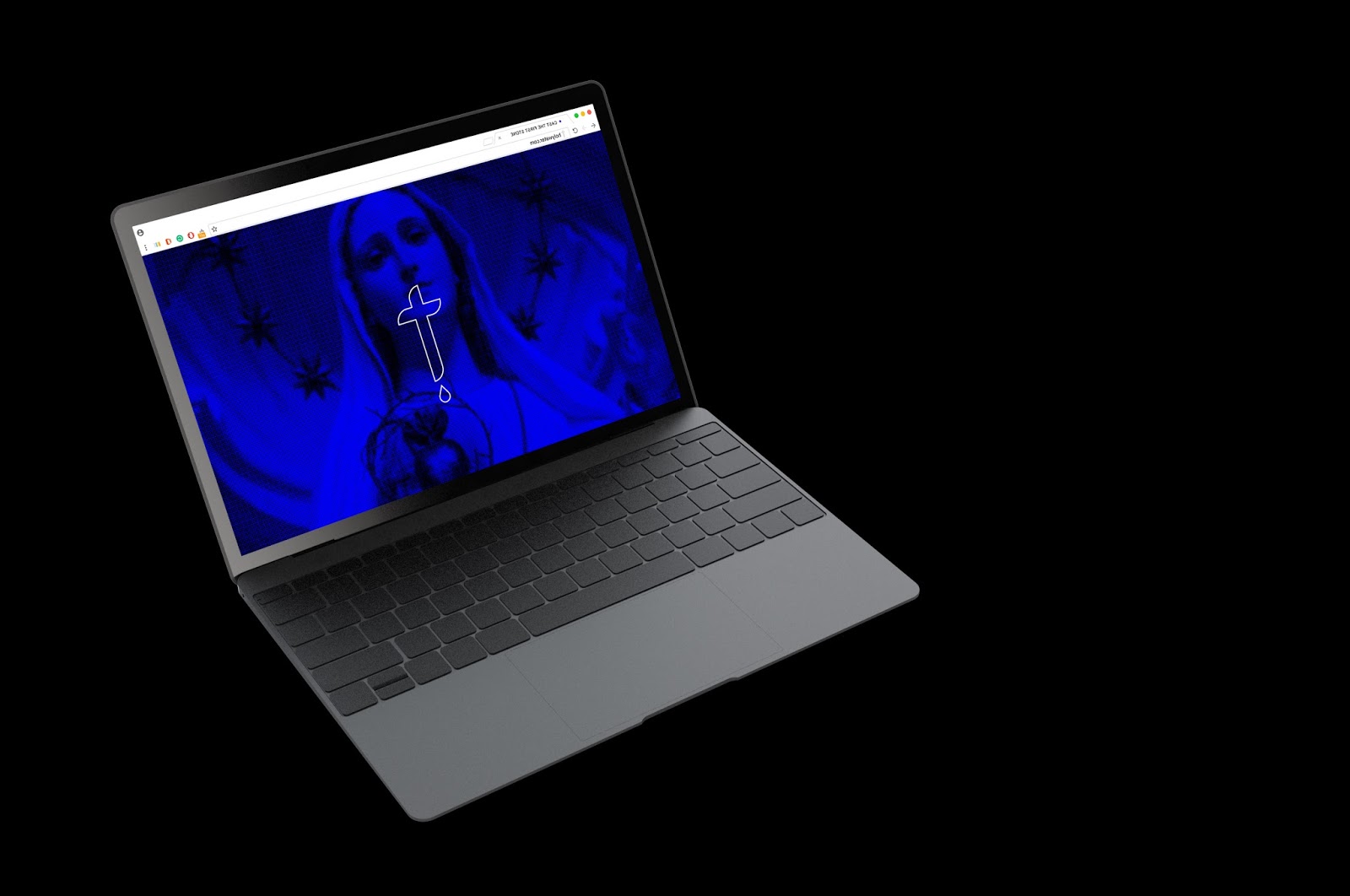
In the first image is how the homepage is envisioned. Relevant dynamic imagery with the cross icon entering initially, for then the whole logo finally appears next. This connotes the mystery of the product that has tried to be captured throughout the various deliverables. It also loosely connects to the act of becoming pure - becoming clear and apparent, having clarity.
The user could either click the logo to enter the page, or it will do it automatically on browser. To achieve this on a mobile device would be more challenging however simple fading in and out of text is not incredibly difficult. On mobile the user may have to physically click the logo as this platform is more interactive than desktop, which is more automatic.
Moving on from this page is the index, where the user has the opportunity to 'repent' digitally. This captures our modern digitally driven world - creating a digital space to experience something that is usually done physically, and provide the user with a more convenient resource that is still endorsed by the same sacrament.
When the user engages with the 'sin' submission box, they will be rewarded for their 'repentence' with a 10% discount on Holy Water. This pushes sales for the product whilst applying Packard's theory, the hidden need of 'ego gratification'; they are praised for consuming/engaging with the website and rewarded, also instilling the need of 'worth', they are a good person because they are now free from sin.
The product page would be kept tidy and not cluttered, having a product description box, button to add item to cart and images of the product to provide the tangible object as the rest of the branding is very ambiguous.
I then began to develop these ideas into a final resolution:

Home page

Sin submission page

Discount page / Submitted

Navigation; again kept clean and simplistic to use. My aim is to try and appeal to a wide range, so the website needs to be user friendly and offer a smooth sailing experience.

Product Page
Product - Mobile Interface


The desktop version was then transferred to mobile dimensions. Everyone uses a smart phone, and so it makes sense to always have a mobile version of a website. The mobile version is still kept clean and similar, but more friendly to use through the resizing of elements and overall composition.
Distribution
A website offers a professional platform to share news, product updates and offers. Information is distributed heavily online due to the focus on technology in our society today. The website offers Christianity / Holy Water to embrace digital means to sell a product and create an engaging environment for the target audience. The website URL will be included on the poster series and also the advertisement to further spread the message and a memorable platform that can be revisited.
Subscribe to:
Comments (Atom)