
Posters


Posters are an efficient way to communicate the brand in a variety of settings. The existence of bus stops, billboards, buildings etc make it simple to host the design anywhere in the public eye for example transport, shopping areas (where the product will be bought), billboards around traffic, even printed onto buses and trains (inside the London underground tubes). Placing it in these everyday settings allow the public to become familiar and intrigued, and if it is seen multiple times or just once, may incline the person to invesigate further. Since posters are usually a method of grabbing attention, I decided to produce two sets - a neutral colour scheme with product placement, and a more ambiguous dramatic set utilising bright colour and abstract imagery. Since the first set displays the product, this offers the audience a tangible product to imagine and mull over, whilst the blue set grabs attention and engages a particular audience (young adults). The more neutral set may attract a more broad range, whilst the blue set communicates a sense of mystery and may appeal to a more focused target audience of youthful and aesthetic conscious demographic.
Due to the nature of the posters, both can be produced in black and white to save on cost, however this product should not be seen as a 'cheap' product and should radiate luxury just like any other 'cosmetic' brand on the shelf. Posters would be ideally printed in colour, avoiding longer methods such as screen printing due to the number of colours both posters contain.
Advertisements
HOLY WATER FULL AD from Lo Wilcock on Vimeo.
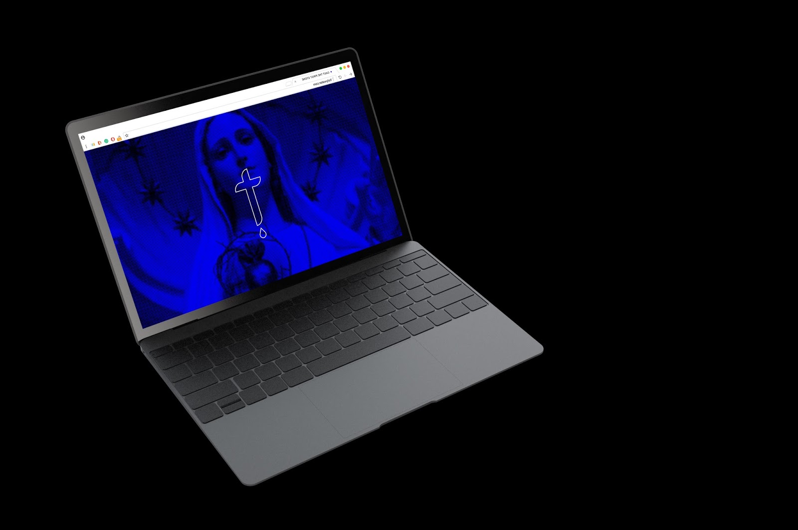
HOLY WATER SHORT AD from Lo Wilcock on Vimeo.
Both a full length 'film' and a shorter ad have been created for the project to show versitility, it is important to consider that there are interchangeable time frames during advertisement breaks, and sometimes a shorter advertisement may be more suitable, and vice versa.
Firstly these advertisements would be seen on television and before the trailers in the cinema. The longer advertisement would be more suitable for the cinema setting due to the nature of it - it is more informative and the audience would be sat down in a dark room available to give maximum attention. Both full length and shorter version would be shown on television and would play according to the time frame during the break. The shorter advertisement aims to grab attention quickly, and so takes a more dynamic approach with an even more energetic treatment.
Both advertisements should correspond with each other to avoid them looking too dissimilar. It would be a goal to ensure the audience can detect them being connected if they were to see one version and then the next on a separate occasion and make a connection.
The advertisement paved the way for the rest of the branding, and so must demonstrate consistency in response to this across the other deliverables.
Website


The existence of a website includes digital platforms and creates a more ubiquitous presence for the brand. Website will be available on both desktop, mobile and tablet to ensure anyone has functional access. Digital platforms are able to reach a large scale of people without much effort. When visiting the website, the user has the option to enter a sin and 'repent', in doing so, they recieve a one time code which offers a discount on the Holy Water product.
This method ensures an interactive experience alongside a 'reward' for the user, and prompts them to share this on social media to gain a wider audience buzz. Reliability is dependent on word of mouth, and so if someone was to share the website, this increases the reputation.
The website will always offer the option to buy Holy Water online, giving those who may not be able to/want to shop in real life the option to buy the product and include this section of the audience.
Packaging / Product


Holy Water would essentially have it's own section in shops such as Boots, John Lewis, Selfridges, Harvey Nichols and Debenhams, in the same manner Chanel and YSL do. An example unboxed product would sit atop a marble/stone pillar and be surrounded by IK Blue colour lights to further communicate brand consistency across the board. This dynamic and impactful display would be an abstract way of luring in interested custom and separating the product from the rest on display. Since this is fundamentally a religious product, the product would also be on display in religious locations; churches, cathederals, ceremonies and high profile places such as The Vatican. The way in which it is displayed would not change to ensure it is communicated in the same way.
Holy Water comes packaged in a plain box, produced on pure white card double sided with intricate stone pattern inside. Embossing the logo gives an extra dimension, matching the textured nature of the product and keeping it ambivalent as the logo would not be as visible than if it was printed, again successfully in keeping with the mysterious nature. Packaging would not be too costly to produce as it could be printed solely in black and white, and is a relatively simple box net which is adapted for the dimensions of the product. Leaflet would be included with each purchase explaining the benefits and purpose of the product.
No comments:
Post a Comment