

The beginning of my initial digital developments, I have created a basic moodboard utilising relevant religious imagery and also the beginnings of type exploration.
In regards to imagery, it makes sense to have an 'icon' in reference to the product. For example, here I have used historical style images of the Virgin Mary, a figure pinnacle to the story of Jesus. Having a mood board of images and ideas helps me in my work process. I listed down various objects and themes which could tie in appropriately if I was to develop them.
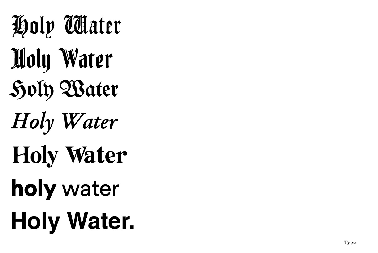
I also experimented with type to demonstrate various avenues I could take the project, for example using traditional typefaces or modern sans serif. It would depend on the demographic and purpose of the campaign. Ideally, I am wanting to appeal to a young target market of men and women, therefore the design must be somewhat contemporary and modern to compete with other products like it in the market.
However, due to trends within graphic design, blackletter and archaic looking typefaces are becoming more and more current, which is something to think about. Could both be combined to create an interesting contrast? Or would a modern approach be the most suitable?
No comments:
Post a Comment